What are classical chart patterns?
Classical chart patterns are recurring price patterns that can be seen on stock charts of all timeframes. They are formed by the interaction of buyers and sellers in the market, and can be used to identify potential reversals or continuations of trends.
 |
| Figure 1: The head and shoulders pattern is one of the most popular models used in reading stock charts. |
A warning about the risks of trading in financial markets. Risk warning: The trading of financial assets or digital currencies carries high risks, including the risk of losing some or all of your investment amount. It may not be appropriate for all investors. Financial markets are highly volatile and may be affected by external factors such as financial or political events, and trade rises on the margin of financial risk.Before deciding to trade in digital markets or currencies, you must be fully aware of the risks and costs associated with trading in financial markets. Consider carefully your investment objectives, level of expertise, willingness to risk and seek financial advice when needed.
The most common classical chart patterns include:
Head and shoulders
This model is considered one of the most important price models that must be focused on due to the high credibility it enjoys, as well as its extreme danger, as it indicates a reversal of the downward trend, which speculators usually take into account. Figure 1 shows the general shape of the head and shoulders pattern, so that we see the stock price has drawn the shape of a human head in the middle with shoulders around it. Often the highest point on the left shoulder is equal to the highest point on the right shoulder, or close to its level, and the lowest point on the left shoulder is equal to the lowest point on the right shoulder, or close to its level.
These last two points represent the neck line, which does not necessarily come in the form of a horizontal line, but may be somewhat slanted. As is the case with the rest of the shapes, the amount of circulation is very important, as it is high at the left shoulder, medium at the head, and weak at the right shoulder. It is important that the analyst does not misunderstand the meaning of the head and shoulders pattern, as the goal here is not to try to predict the emergence of the pattern when we see the appearance of the head. Rather, what we want to know is whether the pattern has been completed or not, and we cannot know that until the right shoulder is completed. There is a closing price lower than the neckline, then we discover that what we have is actually a head and shoulders pattern, and therefore the price may begin to decline. The probability of a decline and thus a trend reversal increases when the trading volume below the neck line is high. At the very least, we expect the stock to fall after breaking the neckline along the distance of the straight line from the top of the head to the neckline. That is, in this example, we find that the rise from the top of the head to the neck line is about $4 (from $14 to $10), so we expect the stock to fall from $10 to about $6 at least.
It is a model that reflects an upward trend into a downward trend.
As for the time period during which the head and shoulders pattern is completed, it can occur in any period of time, but many analysts believe that the period is usually around three months on the daily bar chart, from the beginning of the appearance of the left shoulder until the completion of the right shoulder.
Note :
The time period here is considered relative, and often when technical analysts talk about a period of three months, what is meant is a period of three months in a map in which the duration of each bar is equal to one day, and it is known that patterns in general occur in any time map, even if it is a one-day map with five-minute bars. Or columns of minutes.
However, if this pattern occurs in an inverted manner, this is considered a positive sign that reflects the downward trend and the stock can be bought in it. That is, when we see the head down and the shoulders have been completed, this is positive evidence to buy.
Double Bottom and Double Top's
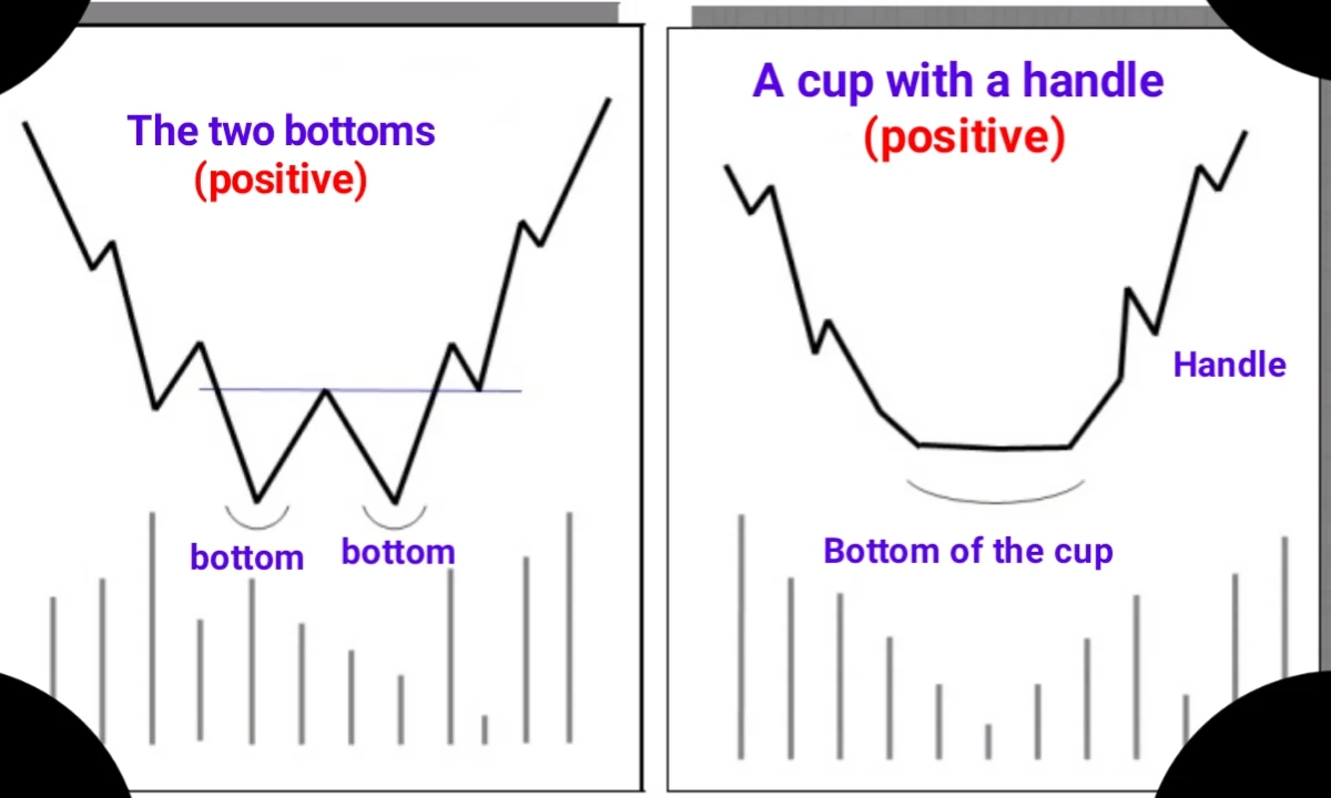
The two-bottom pattern, or the letter W or Double Bottom, is formed when the price goes to a minimum twice and rises again each time, with the price descending the second time to near the first bottom, and sometimes there is a loop shape after the pattern is completed, which if at the end of it there is an increase In trading volume, it is strong evidence of the beginning of the stock’s takeoff (Figure 2).
The arrow's journey after launching is estimated by the length of the distance from the lowest bottom to the area in the middle of the pattern, meaning that the arrow travels a distance that is often no less than this distance. The pattern becomes more reliable when there is a relatively long distance between the two bottoms (for example, a period of a month or more on the daily bar chart), and then we expect with a high degree of probability that the pattern is indeed a two-bottom pattern reflecting the trend.
It is important to note the trading volume in this model, which must be high at the first low and weak or medium at the second low, and the model is not considered complete until there is a move to the top of the area between the two lows (the middle of the letter W).
 |
| Figure 2: The W pattern comes to reflect the downward trend, and the two bottoms are not necessarily equal. |
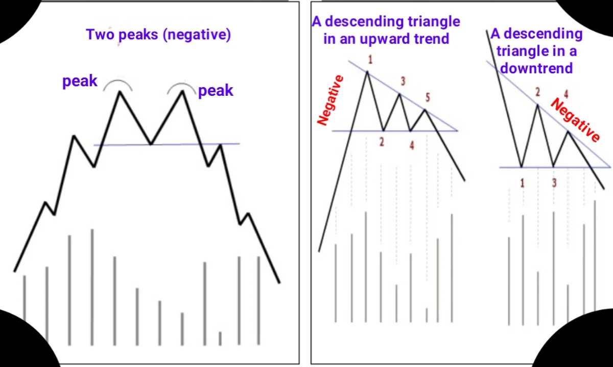
In contrast to this model, there is the two peaks model, or the letter M, or Double Tops, which comes after an upward trend and the first peak appears as a result of continuous buying of the stock, and the price decreases immediately after that to repeat the situation again and reach near the first peak area with a weak or medium amount. And then it starts to fall. The pattern is completed when the price breaks the middle area of the letter M with a high trading volume.
The fall of the stock after breaking is estimated to be at least equal to the length of the distance from the highest peak to the middle area of the pattern. There are other types of two-peak and two-bottom models called Adam and Eve models, and their interpretation does not differ from what we saw here. Rather, they are merely a description of the two-peak or two-bottom model according to the shape of each peak or bottom. For example, if the high (or low) is somewhat sharp and the trading volume is high, it is called Adam. If the peak (or bottom) is less severe, meaning that the price stays near the same place for several days and the trading volume during it is moderate or weak, then it is called Eve. Regardless of the name, these patterns reflect the previous trend and are completed after breaking the area between the two peaks or bottoms.
Saucer pattern
There is what is known as the Saucer Top pattern, which is a trend-reversing pattern, Figure 3. This model resembles an inverted dish. You will find the price at the top of the trend coming in the form of a curve that slopes downwards. It is noted that the trading quantity increases first as the price rises, and this is normal, but it quickly begins to decrease when the price reaches its highest levels. Here we say that the trading quantity It began to dry up because there was no one willing to buy or sell, and the quantity of supply increased over demand and the quantity of trading began to increase as the price fell. Once again, we stress the importance of reading the trading volume compared to the price well, as this indicates the forces of bid and offer and the extent of one superiority over the other.
It is possible to flip the top of the dish pattern to become the bottom of the dish model, which has the same characteristics as the top of the dish model in terms of increasing trading volume when the price falls or rises, and decreasing when the price stagnates at its lowest limit, which is of course a model that reflects the downward trend.
 |
| Figure 3: The dish top pattern is formed with an increase in price accompanied by an increase in trading volume, then the price moderates and falls with an increase in trading volume. |
Cap-with hanld
The cup (or cup or mug) pattern with a handle is considered one of the patterns that reflects the downward trend, so those who do not own the stock should think about buying when the pattern appears, and those who own the stock should keep it for a longer period, and whoever sold the stock previously may decide to buy to cover their prior position.
The cup pattern is completed with a loop from three to six months (on the daily bar chart), and it looks like a coffee cup with a loop when viewed from the side, as shown in Figure 4. The trading volume is high at the edges of the cup and decreases at the bottom of the cup. The reason for the lack of trading at the bottom is due to the failure of most owners of the stock to participate in the selling operations that led to the stock falling in recent periods until it reached the bottom of the cup.
The appearance of the cup pattern with a loop and the reversal of the trend to the upside is confirmed when there is a close at the end of the loop (the location of the arrow shown in the figure) accompanied by a high trading volume.
 |
| Figure 4: Cup pattern with a loop indicating a possible release after the completion of the loop and with high volume. |
There are other models similar to what was mentioned here, and you will find some of them in the summary of models on the following pages, including, for example, the rectangle model (which is similar to a flag) and the slice (or wedge) models, which are similar to triangles. Finally, in the following figures, you will find some examples of how to discover and benefit from models.
Classical chart patterns can be used to identify potential trading opportunities, but it is important to note that they are not guarantees of future price movements. It is also important to consider other factors, such as technical indicators and fundamental analysis, before making any trading decisions.


